Optimize the width of your HTML application
Discover the rules that apply when converting your Excel spreadsheet to HTML so as to master the width of your web application.
In Excel or any other spreadsheet tool the table has nearly no limit. The more you scroll down, the more new rows appear. The more you scroll right, the more columns open. In web applications the space is more restricted and cannot be extend . When we developed and updated the core algorithm of Appizy, we faced the challenge of guessing where to stop the conversion of the sheet. This article guides your through the current logic of the implementation and how to build your workbook in such a way that your users view is most appealing.
Let’s see where the source of the problem lies most often… but if you are in a hurry, here are the main takeaways from this tutorial:
- Do not apply background (image or colour) to the working area in Excel
- Split the user interface from data and calculations
- Stick your user interface top and left ot the worksheet
Assessing emptiness
Appizy does not render empty cells. But what is an empty cell? For Appizy this is a cell without content nor format. So if a cell has a background or a border, Appizy will keep this information and display it. This approach has a limit: what if you decided to fill all the spreadsheet with a blue background? Is Appizy supposed to render 500 columns and 300,000 row of blue?
In the example below you can see a simple BMI (Body Mass Indicator) calculator. The background is set to a light blue on all the cells of the tab.
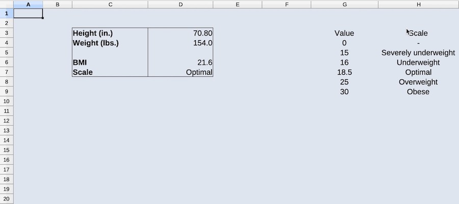
Once converted to HTML you can notice that Appizy did not render the full original blue file. It rather cropped the area around the application. When columns or rows are repeated multiple times, Appizy will remove them until it finds some content in a cell. Thus to not generate too many empty cells, avoid background color for empty cells.
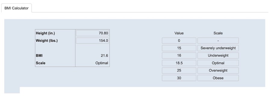
Hidden columns
A first step to optimize the application is to hide the data set of the VLOOKUP function. The columns are simply hidden and the spreadsheet is converted again. In the web app the columns are now gone but there is still a big blue space right from the user interface. This is because Appizy considers the hidden column as the right limit of your application. The space between the interface and the data area are kept because Appizy will not take the decision to erase the cell between used spaces in the grid.
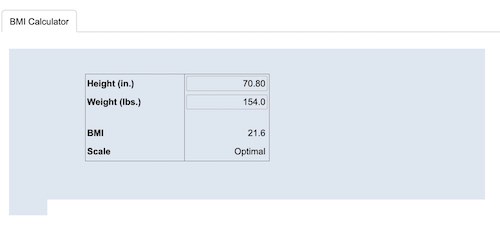
To solve this issue the data are moved to another tab. This tab is hidden in the workbook before conversion. The application is getting cleaner as you can see in the following image. Appizy crops the application closer around the desired area. The hidden is not displayed.
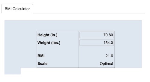
The best practice is to pack all data and calculations in separate tabs and to hide this tab. A good rule of thumb: your spreadsheet should not contain hidden rows neither hidden columns nor cell in white on white background. Only tabs should be hidden.
Split user interface from calculations. Do not hide rows or columns but tabs instead.
Spacing columns and rows
When Appizy cleans unused rows and columns, it goes from bottom to top and right to left. This means that if you leave space on the left and above your user interface then it will not be removed. This is why we can still see the additional blue space next to the user interface. This unused rows and columns are removed in the next iteration.
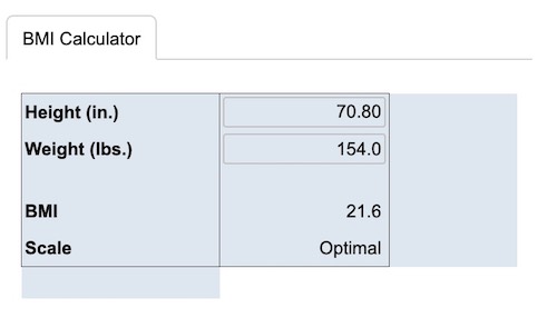
The additional rows and columns you can still see are coming from the coloured background. Once removed from the document the problem is solved.
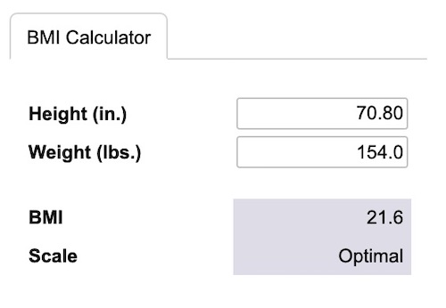
As the last screenshot highlights, the code inspector shows that Appizy rendered only cells that have some content. The application is now ready to be added to your website.
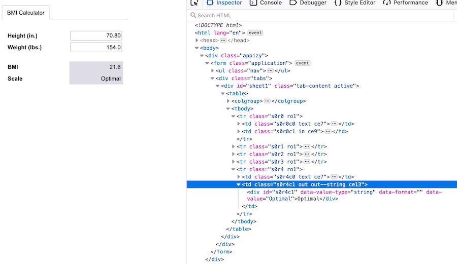
Stick your user interface top and left to the working area. And do not apply a background to the working area… really!
Conclusion
Appizy converts spreadsheet to HTML tag. Some rules are applied when it comes to hidden elements and cells without content but some style. To get the best outcome follow this easy to remember rules to craft your web application:
- Do not apply background (image or colour) to the whole working area in Excel
- Split user interface from the data and calculations
- Stick your user interface to the Top and Left of the working area